The Organizational Checkup is a free assessment from EOS Worldwide. You rate your company on 20 statements, and it scores you across the six parts of a business EOS works on, then gives you a roadmap. Business owners take it alone, leadership teams run it with everyone in the company, and EOS Implementers send it to clients before their first session.
It had been running since around 2018, and it looked it. There was no phone layout: a phone showed the desktop page shrunk to fit. Two copies were live on two domains, and the scheduled jobs that send reminders had no protection on their web addresses. I redesigned every screen, made one copy the real one, and kept everything that already worked.
Where it started
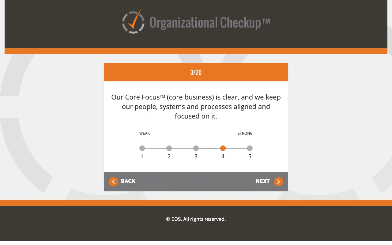
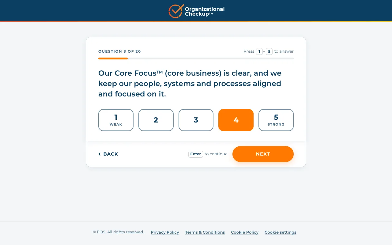
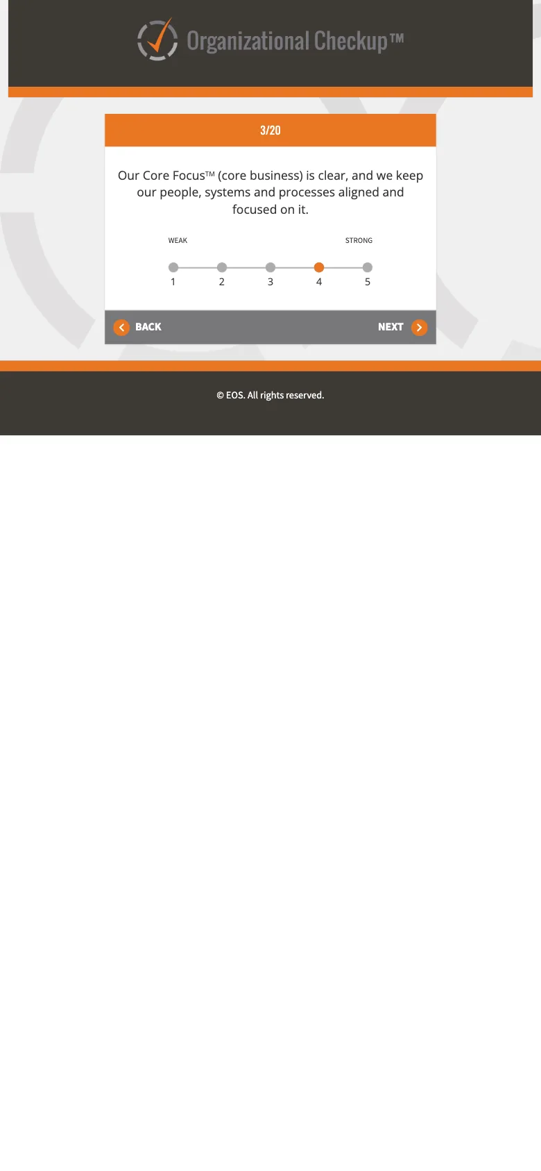
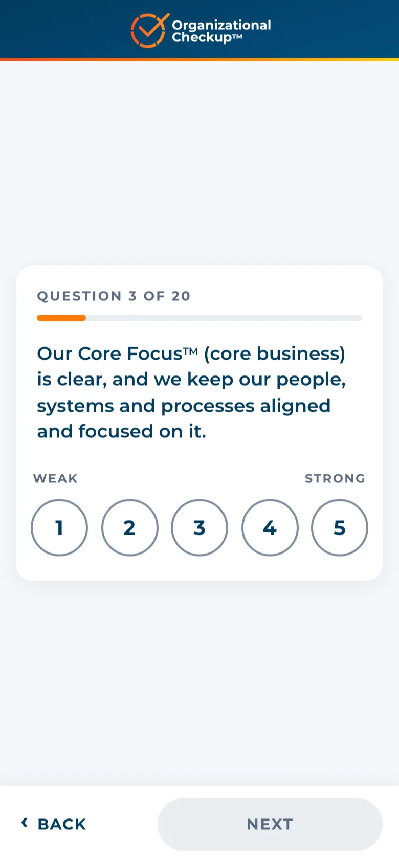
- Thumb-sized answers. The 1 to 5 slider became five large buttons, and Next sits within reach of a thumb. On a keyboard, 1 to 5 answers and Enter moves on.
- Progress you can see. “Question 3 of 20” and a bar, so nobody wonders how long it takes.
- The brand it already had. Navy, orange and Montserrat from the EOS brand guide, in place of the grey and brown of the original.
Results people can read
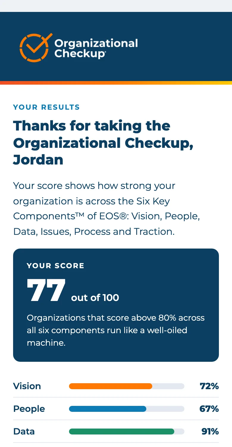
The old results page put a 3D pie chart next to a long table of answers. The new one leads with the score and what to do next: the total out of 100, a bar for each component, and the lowest component named, since that’s where to start. The wheel is drawn as a plain SVG, so it’s sharp on any screen and prints cleanly.
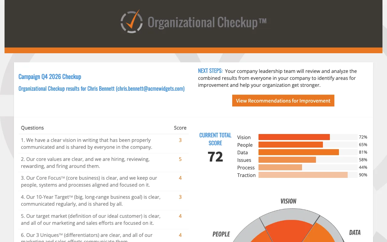
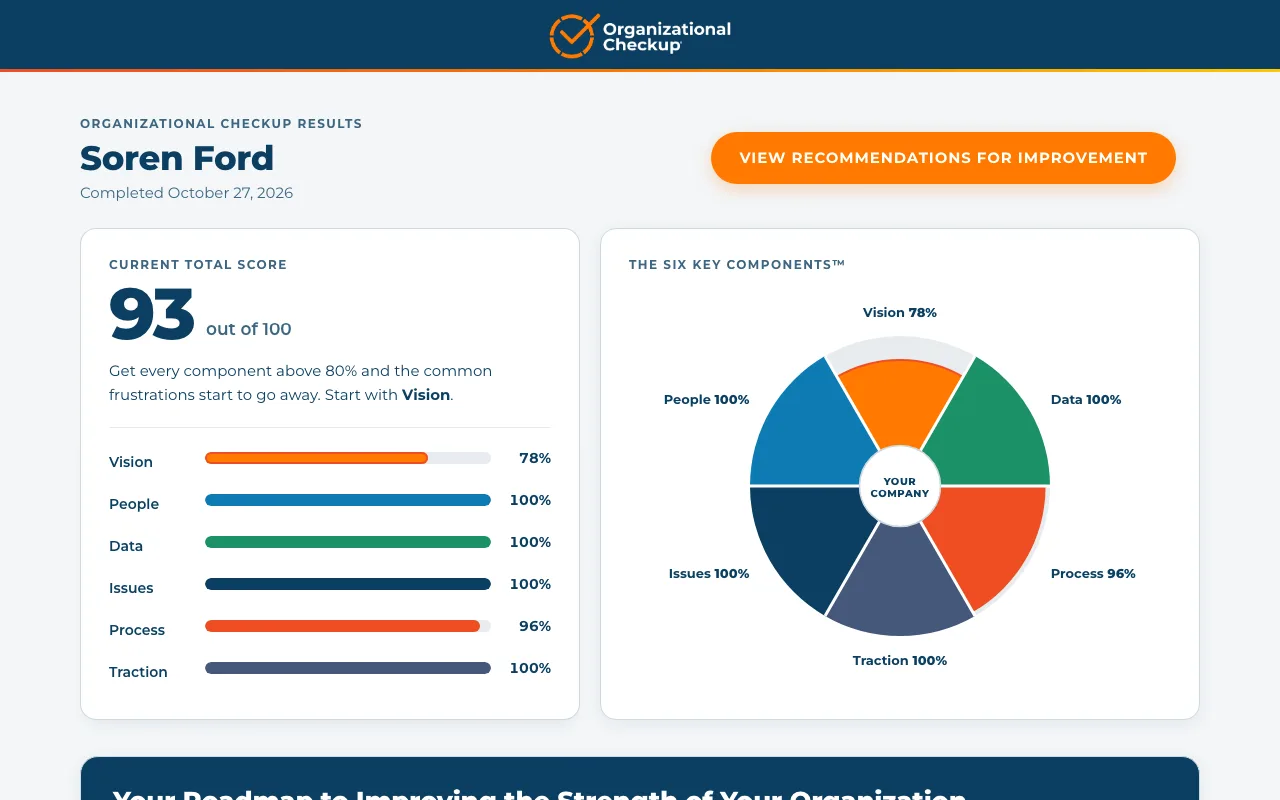
The 20 answers are still there, folded away behind one button, because most people come back for the roadmap, not the table. The roadmap is a tab for each component with its percentage on the tab, and on a phone it becomes an accordion. There’s also a printable report laid out for paper.
The company dashboard
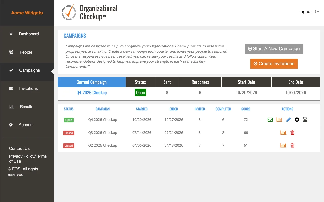
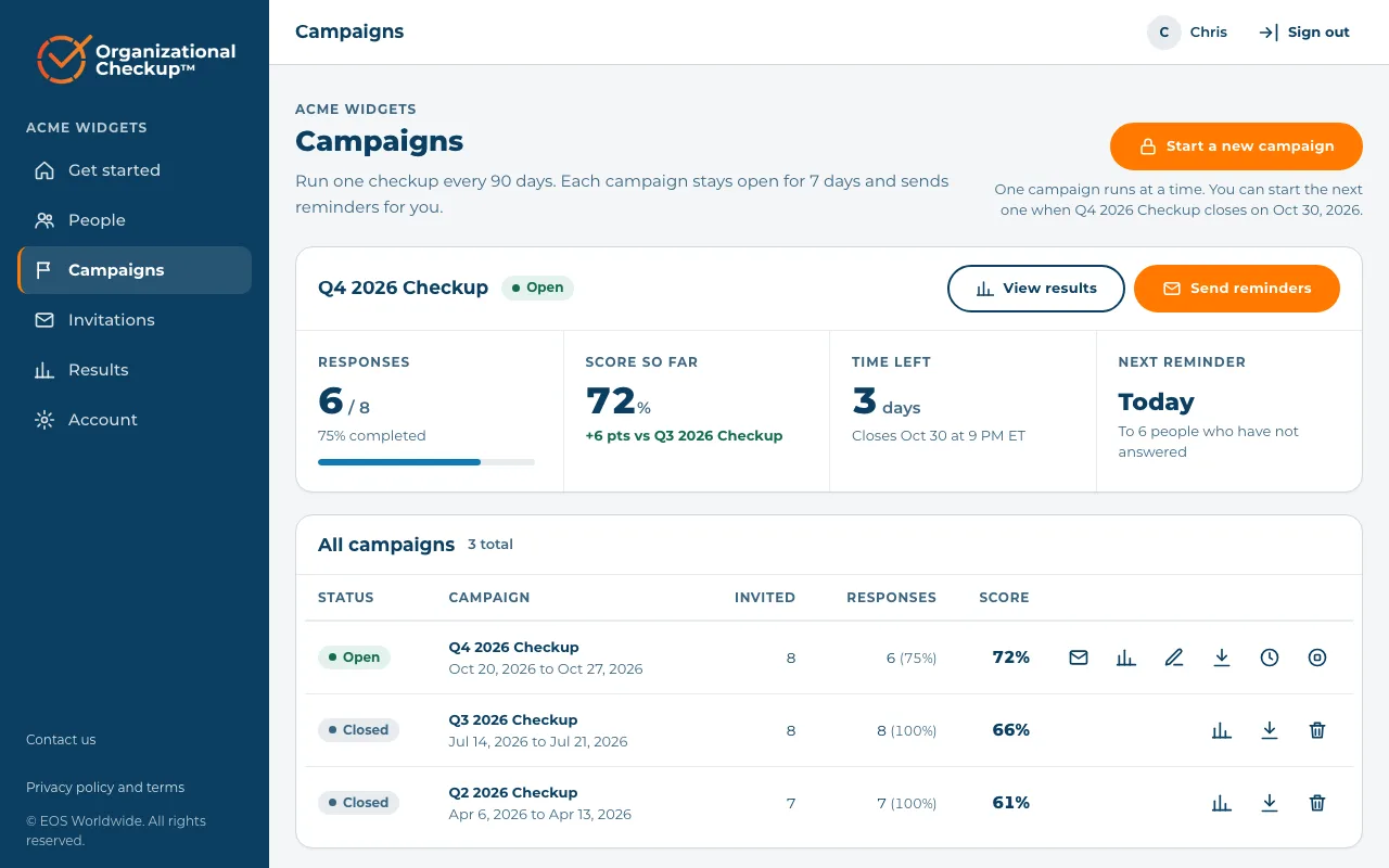
Leadership teams run the Checkup as a campaign: invite everyone, wait a week, read the combined results. The dashboard used to be a table with icons. Now the open campaign shows what someone running it wants to know: how many have answered, the score so far against the last campaign, the time left and when the next reminder goes out.
Tracking that asks first
EOS printed QR codes in books, and wanted to know who came from them. Each code carries a source and a campaign, the Checkup keeps them with the person’s answers, and they arrive in HubSpot as two contact fields, so a book reader can be followed from scan to sale. I tested it end to end by scanning a code myself and finding my own record in HubSpot a few seconds later.
Analytics and advertising cookies stay off until someone accepts. The cookie banner went through legal review: “Decline all” and “Accept all” look exactly alike, a browser’s Global Privacy Control signal counts as declining, and the copyright and policy links stay at the very bottom of the page, with the banner above them.
Testing the tracking turned up a bigger problem. Since January 2024 the Checkup had been sending HubSpot a field name that didn’t exist, and HubSpot rejects a whole update if one field is unknown. Nearly three years of results hadn’t reached the CRM. It now sends only fields HubSpot has, and logs it if HubSpot ever says no.
Nineteen emails, one layout
The Checkup sends 19 different emails, from invitations and reminders to results and password resets. They had grown apart over the years, and in some the logo didn’t show at all. I rebuilt all of them from one layout, written by a small script, so a change to the header or a button happens once and every email gets it.
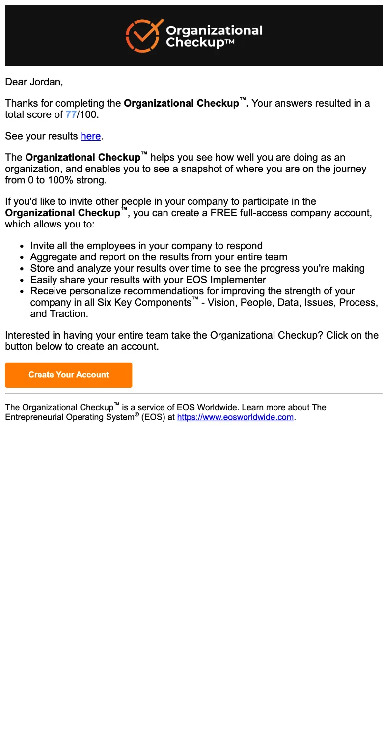
One change came straight from an EOS Implementer. When a client enters their Implementer’s email, the Implementer gets a copy, and since an earlier update it had shown only a first name. Now it’s an email of its own, with the client’s full name, email, role and every score, and the client’s copy no longer tells them to go and find an Implementer.
Shipping it without breaking it
- Nothing lost in the merge. Two copies of the code had drifted apart. I merged them into one and kept every change from both.
- One home. The second copy now redirects to organizationalcheckup.com, so links in old emails and books still work.
- Locked-down jobs. The twelve scheduled jobs that send reminders and campaign updates now need a secret token, so a stranger can’t trigger them.
- Every step approved. Each upload to the live site was a separate step with a backup first.